Posts: 404
Threads: 28
Joined: Jul 2024
Reputation:
0
Discord: KnowledgeBoy
Pronouns: He/Him


2026-07-08, 01:42 PM - Word count:
Graphics Grade: 3/5
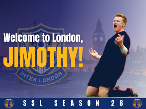
Great composition with the bottom banner and the faded out background showing London! The gradient works well and the text fits well and is clear to read. My only criticism is with the render of Jimothy as it looks blurry, and while your team logo has been implemented, some shading to show some dimension would have been welcome. The red border outlining the render looks cool as a contrast to the blue, but looks rough and jagged.
Keep up the good work!