Posts: 404
Threads: 28
Joined: Jul 2024
Reputation:
0
Discord: KnowledgeBoy
Pronouns: He/Him


2026-09-22, 07:16 AM - Word count:
Graphics Grade: 3/5
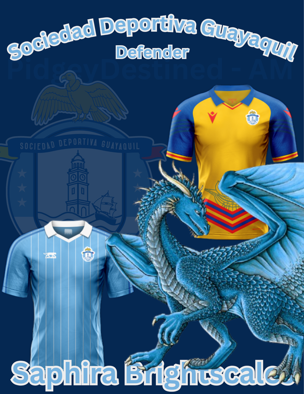
Good job with the included elements and the initial composition! I think from here, some more bordering elements and positional changes can help elevate the graphic. On top of this, I like the idea of the dragon standing on the name text, but as it looks right now, it just looks like a pasted image on top/in front of the text. This can be improved by masking some portions of the dragon's hands and legs to make it seem like it is balancing on top of the text and is more integrated into the graphic itself!